Why Radix Themes power the new Turso interface

When we decided to implement a new version of our dashboard, we faced the dilemma of which UI library to use, if any.
#Starting Over
When we decided to implement a new version of our dashboard, we had plenty of room to make multiple technical decisions that were going to impact the final result as well as our development speed.
Also, working on the new dashboard implied that we were going to stop working on new features to the existing one, so we needed to be able to move fast. Using a UI library was the most logical decision in order to deliver fast without compromising on quality.
We knew that we wanted to use a UI library and the question we asked ourselves: what’s the best tool for our use case that will allow us to move fast and that plays nicely with our brand?
#Why not Implement These UI Components Ourselves?
Accessibility is hard to get right and that’s why there are multiple solutions out there that take care of accessibility so we don’t need to reinvent the wheel. We want to provide an accessible application, but at the same time we don’t have enough throughput to do this ourselves, so using a third party solution was a good middle point.
Radix adheres to WAI-ARIA design patterns where possible and is tested in multiple browsers and assistive technologies and also provides pre-built components so we can work fast without the fear of breaking the UI, especially when there are lots of browsers and devices out there and a change can break something unexpected in just some of them. Radix is also used by big companies like Vercel, Linear, and CodeSandbox.
#Radix or Radix Themes?
Radix (or Radix primitives) refers to the unstyled components library. On the other hand, Radix Themes is a component library built on top of Radix, which provides styled components under a customizable theme.
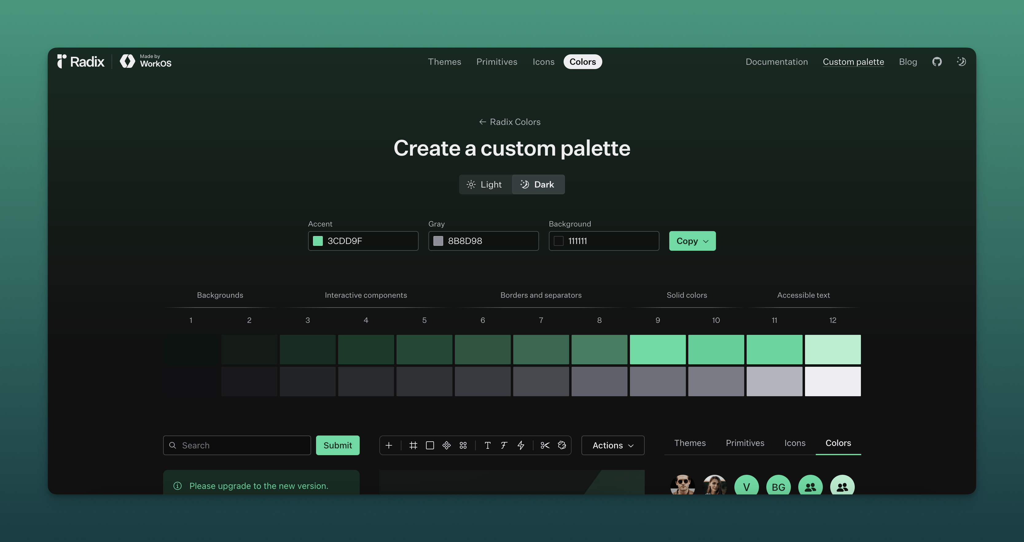
We needed something accessible that plays well with our brand color scheme, and allows our team to add new features fast. Radix Themes was a natural choice for us because it ticks all the boxes and also because they provide a custom palette generator that will give us flexibility in the future in case we want to provide more themes to our users (some said Turso light mode? ☀️).

#The Good
Radix API is simple to use. Most of the time we look up the component we want to use in their docs, copy the example source code and adapt it to our needs. Plus, using themes means that we don’t need to care about styling, which is a big time-saver when working on new features.
We use lots of these components through our app like Alert Dialog, Button, Badge, Callout, Skeleton, and Hover Card, and all of them adapt gracefully to the selected color scheme and handle different states like disabled and loading.
Radix’s Playground is an indispensable tool that we use daily to preview components and their different states, which makes quite easy to see how a component will look on a specific state.

#Challenges
Although usually Radix is quite easy to work with, we’ve been having a hard time customizing it, which is expected because they state that on their website. However, after working with it for some time, we get used to moving fast and having this limitation of not having to customize the default themes.
Another thing we had some issues with, is that we use Tailwind CSS internally, which has a different color palette and scale. To bring Radix’s colors to Tailwind, we started using the radix-themes-tw library, which has worked great for us. In fact, most of the time we forget that it’s there because we have never had issues with it.
#Final Thoughts
One of the things we like the most about Radix Themes is that it composes really well, so embedding components into other components just works. Also, the constraints it provides allow us to move fast by sticking to them.
Radix Themes has allowed us to move fast without breaking things. It’s certainly not the only tool out there, but we decided to use it and has worked well for us. We’re happy with the existing components and we’re also looking forward to some new components to come in too 👀